
Table of Contents
Have you ever wanted to display 2 HTML elements side by side? Then you are at the right place. In this article, we will see 5 different ways to display 2 divs side by side.
Inline-block method
This is the most traditional method of displaying 2 HTML elements next to each other.
Here we provide the style display:inline-block to the divs which are needed to be displayed side by side.
Create 2 divs and a wrapper div.
1<div class="wrapper">2 <div class="child">1</div>3 <div class="child">2</div>4</div>
In the stylesheet file, you can add the following styles.
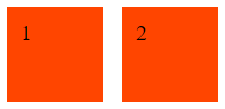
1.child {2 display: inline-block;3 margin: 5px;4 padding: 10px;5 width: 50px;6 height: 50px;7 background: orangered;8}
The output will be:
Flexbox method
Flexbox is the most popular and my favorite way to display 2 divs side by side.
Unlike inline-block method, in flexbox method we will be applying the styles to the wrapper div.
1<div class="wrapper">2 <div class="child">1</div>3 <div class="child">2</div>4</div>
Update the css to the following:
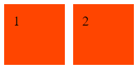
1.wrapper {2 display: flex;3}4.child {5 margin: 5px;6 padding: 10px;7 width: 50px;8 height: 50px;9 background: orangered;10}
As you can see, it is just 1 line of CSS. The output will be:
Grid method
The next way to display 2 divs next to each other is to use CSS grid.
1<div class="wrapper">2 <div class="child">1</div>3 <div class="child">2</div>4</div>
Update the css to the following:
1.wrapper {2 display: grid;3 grid-template-columns: 1fr 1fr;4 grid-gap: 20px;5}6.child {7 padding: 10px;8 width: 50px;9 height: 50px;10 background: orangered;11}
As you can see, we have used grid-gap instead of margin to specify the spacing between the child items.
We have a property named grid-template-columns, which specifies how many columns we have and how much space the child items should occupy horizontally.
Here, 1fr means 1 fractional unit. Since we have set 1fr twice, there will be 2 columns with the same width.

By default, the grid layout will occupy the entire screen width.
If you want the grid to occupy only the width it needs, add the style width:fit-content to the wrapper class.
If you need to specify different width to each element, then you can specify different numbers for the grid-template-columns property.
For example, grid-template-columns: 1fr 3fr will make the first div to have a width of 25% (100 * 1fr / (1fr + 3fr)) and a width of 75% to the second (100 * 3fr / (1fr + 3fr)).
Float method
Float CSS property places an element on the left or right side of its container, allowing text and inline elements to wrap around it.
If we specify float:left to the child elements, they will align next to each other when there is space.
1<div class="wrapper">2 <div class="child">1</div>3 <div class="child">2</div>4</div>
Update the css to the following:
1.child {2 float: left;3 margin: 5px;4 padding: 10px;5 width: 50px;6 height: 50px;7 background: orangered;8}
The output will be:

Table method
This is one of the oldest ways to align 2 HTML elements horizontally.
1<div class="container">2 <div class="table-row">3 <div class="table-cell">1</div>4 <div class="table-cell">2</div>5 </div>6</div>
As you can see, we need a couple of wrapper divs around the child elements.
Update the css to the following:
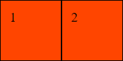
1.container {2 display: inline-block;3}4.container {5 display: table;6}7.table-row {8 display: table-row;9}1011.table-cell {12 display: table-cell;13 border: 1px solid;14 margin: 5px;15 padding: 10px;16 width: 50px;17 height: 50px;18 background: orangered;19}
The output will be:
This method is not preferred these days due to the amount of css needs to be written.
If you have liked article, do follow me on twitter to get more real time updates!