
Table of Contents
You might have seen many solutions to align the footer to the bottom when there isn't enough content on the page. In most of the solutions, the height of the footer needs to be known or it will use some hacky JavaScript.
In this article, we will see how to align the footer to the bottom
- With pure CSS
- Footer with dynamic height
- No extra padding/margin, div, or calculations
When there is enough content, the footer will merge along with the content and will not stick to the bottom.
Basic setup
First, create a CSS file named styles.css, and add the following basic styles.
The following styles are purely for decorative purposes.
1body {2 margin: 0;3}45footer {6 background-color: teal;7 border: 1px solid;8 padding: 1rem;9 color: white;10}11button {12 margin: 10px;13}14.content {15 padding: 1rem;16}
Create a file named index.js and add the following code:
1import "./styles.css"2function addContent() {3 const contentDiv = document.querySelector(".content")4 const newDiv = document.createElement("p")5 newDiv.innerHTML =6 "Lorem ipsum dolor, sit amet consectetur adipisicing elit. Placeat ad fuga omnis, assumenda magni nulla maxime explicabo tempora alias nam molestias velit fugit harum dolore? Incidunt doloribus officia sapiente hic."7 contentDiv.appendChild(newDiv)8}910const button = document.getElementById("button")1112if (button) {13 button.addEventListener("click", addContent)14}
The above JavaScript is there purely for adding content to the page so that we can see how the footer behaves when there is less content and when there is content, which adds a scrollbar.
Update the index.html with the following code:
1<!DOCTYPE html>2<html lang="en">3 <head>4 <meta charset="UTF-8" />5 <meta name="viewport" content="width=device-width, initial-scale=1.0" />6 <meta http-equiv="X-UA-Compatible" content="ie=edge" />7 <title>Document</title>8 <script src="./index.js"></script>9 </head>10 <body>11 <div class="content">12 <button id="button">Add content</button>13 </div>14 <footer>15 Lorem ipsum dolor sit amet consectetur adipisicing elit. Doloremque16 delectus exercitationem necessitatibus est minus quae autem ex, incidunt17 dolorum vitae, aspernatur illo, sint sit illum? Quidem cumque maxime18 laboriosam nulla?19 </footer>20 </body>21</html>
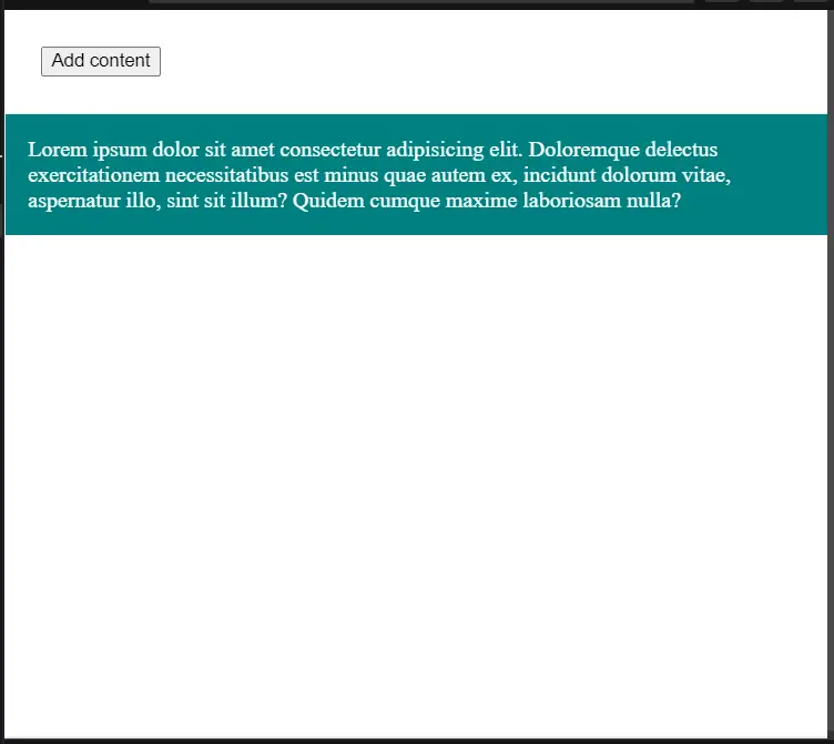
If you open index.html in the browser now, you will see the footer at the top.
Flexbox solution
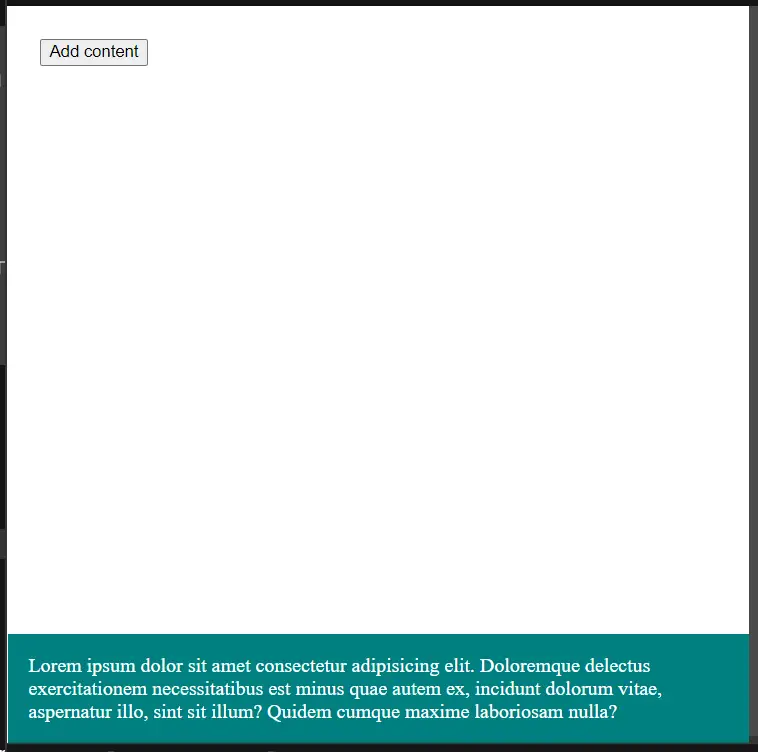
We can use the flexbox to align the footer to the bottom.
1<!DOCTYPE html>2<html lang="en">3 <head>4 <meta charset="UTF-8" />5 <meta name="viewport" content="width=device-width, initial-scale=1.0" />6 <meta http-equiv="X-UA-Compatible" content="ie=edge" />7 <title>Document</title>8 <script src="./index.js"></script>910 <style>11 html,12 body {13 height: 100%;14 }15 body {16 display: flex;17 flex-direction: column;18 }19 .content {20 flex: 1 0 auto;21 }22 .footer {23 flex-shrink: 0;24 }25 </style>26 </head>27 <body>28 <div class="content">29 <button id="button">Add content</button>30 </div>31 <footer>32 Lorem ipsum dolor sit amet consectetur adipisicing elit. Doloremque33 delectus exercitationem necessitatibus est minus quae autem ex, incidunt34 dolorum vitae, aspernatur illo, sint sit illum? Quidem cumque maxime35 laboriosam nulla?36 </footer>37 </body>38</html>
Here,
- We have added a height of 100% to the body so that footer can be aligned to the bottom.
- We have made the body as a flexbox with direction as column.
-
flex:1 0 automakes the content to occupy the available height and pushes the footer to the bottom. flex-shrink: 0ensures that the footer occupies the required height and does not shrink away.
Grid solution
If you are a grid person, we have a solution for you as well.
1<!DOCTYPE html>2<html lang="en">3 <head>4 <meta charset="UTF-8" />5 <meta name="viewport" content="width=device-width, initial-scale=1.0" />6 <meta http-equiv="X-UA-Compatible" content="ie=edge" />7 <title>Document</title>8 <script src="./index.js"></script>910 <style>11 html {12 height: 100%;13 }14 body {15 min-height: 100%;16 display: grid;17 grid-template-rows: 1fr auto;18 }19 .footer {20 grid-row-start: 2;21 grid-row-end: 3;22 }23 </style>24 </head>25 <body>26 <div class="content">27 <button id="button">Add content</button>28 </div>29 <footer>30 Lorem ipsum dolor sit amet consectetur adipisicing elit. Doloremque31 delectus exercitationem necessitatibus est minus quae autem ex, incidunt32 dolorum vitae, aspernatur illo, sint sit illum? Quidem cumque maxime33 laboriosam nulla?34 </footer>35 </body>36</html>
Here, grid-template-rows: 1fr auto; makes the first item (content) to occupy the available space and
the second item (footer) to occupy only the required space.
Demo
You can view the flex box demo here and the grid demo here.
If you have liked article, do follow me on twitter to get more real time updates!