
Table of Contents
You might have seen in recent times that people are shifting towards dark mode, be it mobile screens, the browser or you favorite social media app. You might be wondering how can you implement the same in react in your website. In this tutorial, we will see how we can have a toggle button and change the theme of the page when the user clicks on it. We will also see how we can read the browser theme (dark/light) and load the page based on that theme. Also, we would see how the user preference can be saved so that we can retain the theme settings for future visits.
Creating the app
First of all, as usual, let's create a react app using the following command
1npx create-react-app dark-theme
Basic page setup
Let's set up a sample HTML page for the demonstration.
Update the App.js file with the following code.
You could see that we have created a navbar that has a toggle button,
which will be used to switch the theme and a heading and a couple of paragraphs of lorem ipsum text.
1import React from "react"2import "./App.css"34function App() {5 return (6 <div className="App">7 <nav className="navigation">8 <div className="logo">Dark Mode</div>9 <button className="toggle_btn">Toggle</button>10 </nav>11 <h1>Lorem ipsum dolor sit amet consectetur adipisicing elit.</h1> <p>12 Lorem ipsum dolor sit amet consectetur adipisicing elit. Rem, placeat13 adipisci aut repudiandae molestias quis possimus dignissimos tenetur14 tempore numquam, eos, sed deleniti quae voluptas asperiores harum labore15 ab deserunt? Perspiciatis, quisquam totam sapiente dolore cum, officiis16 veritatis sed ut quidem corrupti animi! Officiis animi quaerat officia17 ducimus, eveniet magnam delectus cupiditate amet vero aspernatur18 perferendis dolorem dignissimos praesentium vitae. Architecto dolorem19 eius distinctio nostrum fugit! Quas molestias, unde possimus vitae20 totam, quam eum earum est inventore harum aperiam praesentium sapiente21 repellat minima dolor corrupti eligendi, tempore reprehenderit animi22 delectus. Perferendis, et maxime reprehenderit possimus numquam23 corrupti, libero sed veniam optio vel a voluptates? Vel deserunt a animi24 saepe, dolores consequatur obcaecati ratione odio, ducimus repellendus25 aperiam error, laborum sed. Aspernatur excepturi vitae sint doloremque26 unde ipsa veniam placeat debitis? Aspernatur reprehenderit quibusdam27 pariatur fuga numquam voluptate magni praesentium optio nisi repellat28 placeat maxime at similique, provident, consequuntur, corrupti adipisci!29 </p>30 <p>31 Lorem ipsum dolor, sit amet consectetur adipisicing elit. Quis tempora32 maiores fugiat neque doloribus illum omnis expedita aliquam voluptatum33 possimus ad mollitia laudantium, non cumque quia, illo tempore odit34 veniam! Nisi enim, eligendi error quod dicta sunt fugit non et. Repellat35 corporis officiis odio repudiandae doloremque similique quisquam dicta36 enim, porro sed assumenda architecto iste accusantium quo quod, in37 incidunt? Eaque ipsum, id commodi reprehenderit quam exercitationem ad38 iure a cum necessitatibus corporis quas, odit, deserunt atque reiciendis39 deleniti fuga et laudantium officia adipisci. Voluptates, nesciunt!40 Repellendus consequuntur voluptate vero? Officia quaerat voluptates41 dolorem provident excepturi expedita nostrum, voluptas consequatur42 architecto. Vel recusandae officia quidem impedit magni cupiditate?43 Deserunt qui velit totam dolorem delectus necessitatibus possimus44 explicabo veritatis doloremque sequi. Optio, quod quaerat fugiat45 recusandae officia earum voluptatem aliquam unde obcaecati laborum46 necessitatibus porro omnis laboriosam esse, illum numquam quibusdam47 magnam. Voluptate et nesciunt quisquam sequi perferendis minus quaerat48 temporibus!49 </p>50 </div>51 )52}5354export default App
Now add some basic styling in the index.css file.
You might notice that css variables are made use of, which will come handy in the upcoming sections.
1body {2 margin: 1rem auto;3 max-width: 800px;4 background-color: #fff;5 color: #000;6 --button-text: #000;7 --button-bg: #fff;8}910.toggle_btn {11 background-color: var(--button-bg);12 color: var(--button-text);13 cursor: pointer;14}15.navigation {16 display: flex;17 justify-content: space-between;18}19.logo {20 font-size: 1.2rem;21 font-weight: 600;22}
Now run the app by using yarn start command and opening http://localhost:3000.
You should be able to see a similar page given below:
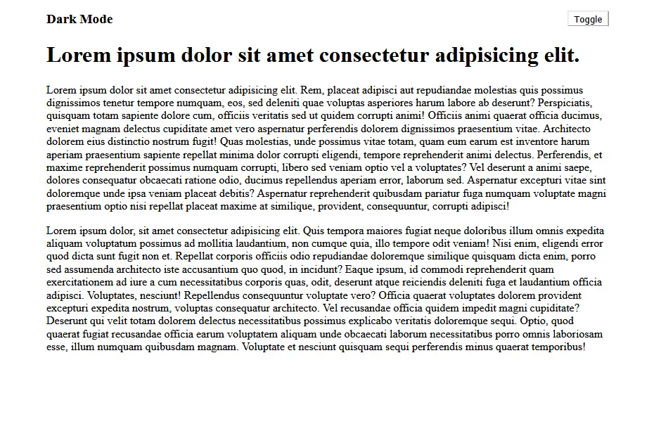
Now clicking on toggle button will not do anything. Let's make it work!
The useDarkMode Hook
We will be writing a custom hook in order to implement the dark mode functionality.
So let's create a folder named hooks inside the src directory and create a file called useDarkMode.js
Update the file with the following code:
1import { useEffect, useState } from "react"23export default () => {4 const [isDark, setIsDark] = useState(false)56 useEffect(() => {7 const className = "dark"8 if (isDark) {9 window.document.body.classList.add(className)10 } else {11 window.document.body.classList.remove(className)12 }13 }, [isDark])1415 return [isDark, setIsDark]16}
You could see that in the above code, we are initializing a local state variable using useState hook and defaulting it to false.
This state will determine if dark mode is enabled or not. Also, we are making use of useEffect hook,
where we are checking if the isDark state is set true or false and adding/removing the class named dark from the body of the document.
You could also see that we have added isDark as a dependency to the useEffect hook,
such that the effect runs only when the value of the isDark state changes.
Making use of the useDarkMode hook
Now let's make use of the hook we have created, in the App.js and binding it with the button click:
1import React from "react"2import "./App.css"3import useDarkMode from "./hooks/useDarkMode"45function App() {6 const [isDarkMode, setDarkMode] = useDarkMode()7 return (8 <div className="App">9 <nav className="navigation">10 <div className="logo">Dark Mode</div>11 <button className="toggle_btn" onClick={() => setDarkMode(!isDarkMode)}>12 Toggle13 </button>14 </nav>15 <h1>Lorem ipsum dolor sit amet consectetur adipisicing elit.</h1>16 ...17 </div>18 )19}2021export default App
In the above code you will see that each time the user clicks on the toggle button,
we are calling setDarkMode with a negated value of isDarkMode, so that it will be set to true and false in successive clicks.
Now, if you try to click on the toggle button, you may not see any changes happening.
But, if you inspect the document and see, you will see the class dark being added and removed.
Adding styles to dark mode
Now that we have added dark class to the body, we can use the css to change the background and font colors to establish the dark mode.
Add the following rules to index.css
1body.dark {2 background-color: #000;3 color: #fff;4 --button-text: #fff;5 --button-bg: #000;6}
In the above styles, we are setting the background color to black and text color to white whenever body has the class dark.
Also, you will see that we are making use of css variables to control the styles of the button.
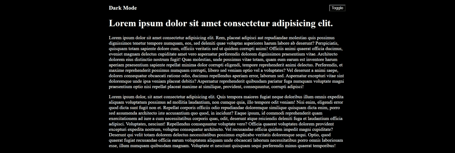
If you click on the toggle button now, you should be able to see the theme getting toggled:
Storing user preference in Local Storage
As a user, you might want your choice of theme to be remembered and retained in that mode whenever you revisit the page in the future. Currently, if you set to dark mode and reload the page, the page will load in light mode. To preserve the mode, we will store the user preference in Local Storage.
Update useDarkMode.js with the following code
1import { useEffect, useState } from "react"23export default () => {4 const key = "isDarkMode"5 const [isDark, setIsDark] = useState(() => {6 try {7 // Get from local storage by key8 const item = window.localStorage.getItem(key)9 // JSON.parse converts from Sting to Boolean10 return item ? JSON.parse(item) : undefined11 } catch (error) {12 // If error return false, i.e, light mode13 return false14 }15 })1617 useEffect(() => {18 const className = "dark"19 if (isDark) {20 window.document.body.classList.add(className)21 } else {22 window.document.body.classList.remove(className)23 }24 try {25 window.localStorage.setItem(key, isDark)26 } catch (e) {27 console.error("Error in setting preference")28 }29 }, [isDark])3031 return [isDark, setIsDark]32}
If you see in the above code, we are using a callback for initializing the isDark state and in the callback, we are accessing the local storage to fetch the preference of the user. When the user toggles the state, we save the preference to the local storage in the useEffect callback.
If you set the preference to dark mode and reload the page, you would see that the page loads in dark mode.
Reading browser theme/settings
Most of the modern browsers support media query called prefers-color-scheme,
using which we can determine if the user prefers dark mode or light mode.
We can make use of the Window.matchMedia()
method to query the value of prefers-color-scheme, as highlighted in the code below.
Also, note that we have introduced a new variable darkModeEnabled, which now stores the preference value.
1import { useEffect, useState } from "react"23export default () => {4 const key = "isDarkMode"5 const [isDark, setIsDark] = useState(() => {6 try {7 // Get from local storage by key8 const item = window.localStorage.getItem(key)9 // JSON.parse converts from Sting to Boolean10 return item ? JSON.parse(item) : undefined11 } catch (error) {12 // If error return false, i.e, light mode13 return false14 }15 })1617 // Check if user has any preference in the local storage.18 // If not then load the system preference1920 const darkModeEnabled =21 typeof isDark !== "undefined"22 ? isDark23 : window.matchMedia("(prefers-color-scheme: dark)").matches24 useEffect(() => {25 const className = "dark"26 if (darkModeEnabled) {27 window.document.body.classList.add(className)28 } else {29 window.document.body.classList.remove(className)30 }31 try {32 window.localStorage.setItem(key, darkModeEnabled)33 } catch (e) {34 console.error("Error in setting preference")35 }36 }, [darkModeEnabled])3738 return [darkModeEnabled, setIsDark]39}
Now if your system set into dark mode, then by default the page will open in dark mode.
Displaying different Icons for each mode
Now let's show a separate icon for both dark and light mode. We will make use of react-icons for this purpose.
Install react-icons using the following command:
1yarn add react-icons
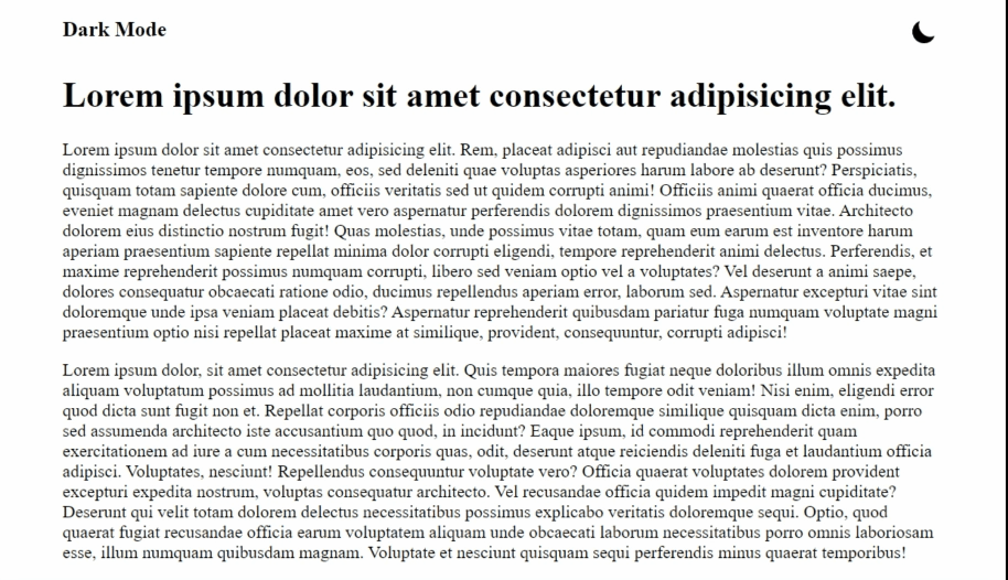
Once the installation completes, make use of the BsSun and BsMoon icons to represent the light and dark mode respectively:
1import React from "react"2import "./App.css"3import useDarkMode from "./hooks/useDarkMode"4import { BsMoon, BsSun } from "react-icons/bs"56function App() {7 const [isDarkMode, setDarkMode] = useDarkMode()8 return (9 <div className="App">10 <nav className="navigation">11 <div className="logo">Dark Mode</div>12 <button className="toggle_btn" onClick={() => setDarkMode(!isDarkMode)}>13 {isDarkMode ? (14 <BsSun color="#ff0" size="24" title="Switch to light mode" />15 ) : (16 <BsMoon size="24" title="Switch to dark mode" />17 )}18 </button>19 </nav>20 <h1>Lorem ipsum dolor sit amet consectetur adipisicing elit.</h1>21 ...22 </div>23 )24}2526export default App
Finally, update the CSS file to remove the border from the button
1...2.toggle_btn {3 background-color: var(--button-bg);4 color: var(--button-text);5 cursor: pointer;6 border: none;7}8...
Now load the page and you should be able to see the icons added!
Source code and Demo
You can view the complete source code here and a demo here
If you have liked article, do follow me on twitter to get more real time updates!