Table of Contents
You might have used a lot of npm packages in your project. Have you ever wondered how to create one of your own?
In this article, we will see in detail how to create a reusable React component, package it using rollup, and publish it to npm.
Project setup
Let's say you are planning to create a beautiful button and you want to publish it to npm.
We will not be using Create React App to create our package. Create React App is used to quickly spin up web applications. For packaging, we will be creating a plain npm project and adding the configurations to it.
First, create a directory named spunky-buttons (or a name of your choice) and run the following command inside it.
1npm init -y
This initializes an npm project with default options.
Now open the project in VSCode or a similar editor and install the following packages
1npm i -D react react-dom typescript @types/react @types/react-dom
We will be writing our component in TypeScript. The advantage of writing it in TypeScript is that you don't need to specify the type definitions separately. Also, the packages are expected to be written in TypeScript.
Now create a file called tsconfig.json at the root of the project with the following content:
1{2 "compilerOptions": {3 "outDir": "dist",4 "module": "esnext",5 "target": "es5",6 "lib": ["es6", "dom", "es2016", "es2017", "es2018.promise"],7 "sourceMap": true,8 "allowJs": false,9 "jsx": "react",10 "declaration": true,11 "moduleResolution": "node",12 "forceConsistentCasingInFileNames": true,13 "noImplicitReturns": true,14 "noImplicitThis": true,15 "noImplicitAny": true,16 "strictNullChecks": true,17 "suppressImplicitAnyIndexErrors": true,18 "noUnusedLocals": true,19 "resolveJsonModule": true,20 "allowSyntheticDefaultImports": true,21 "noUnusedParameters": true,22 "plugins": [23 {24 "name": "typescript-plugin-css-modules"25 }26 ]27 },28 "include": ["src", "typings.d.ts"],29 "exclude": ["node_modules", "dist", "rollup.config.js"]30}
To understand the meaning of each property, you can refer to the TypeScript documentation.
Optional: If you are planning to have css modules in your package, then create a file named typings.d.ts with the following content:
1declare module "*.module.scss"2declare module "*.module.css"
Configuring rollup
We will be using rollup as a module bundler for our component.
First, install the necessary packages as development dependency using the following command:
1npm i -D rollup rollup-plugin-typescript2 rollup-plugin-postcss babel-core babel-runtime sass
Create a file named rollup.config.js at the root with the following content:
1import typescript from "rollup-plugin-typescript2"2import postcss from "rollup-plugin-postcss"3import pkg from "./package.json"4export default {5 input: "src/index.tsx",6 output: [7 {8 file: pkg.main,9 format: "cjs",10 exports: "named",11 sourcemap: true,12 strict: false,13 },14 ],15 plugins: [16 postcss({17 extract: false,18 }),19 typescript({ objectHashIgnoreUnknownHack: true }),20 ],21 external: ["react", "react-dom"],22}
In the above configuration,
-
input- Tells rollup which is the starting component. All the components inside theindex.tsxwill be bundled. output- Specifies the name of the output file (imported from package.json, which will be updated later) and the type of formatting.plugins- Mentions the plugins that need to be used while compiling. In our case, we have provided postcss and TypeScript.external- Tells which are the external packages and they need to be present in the project where the component will be used.
Updating the package.json
First, update the main property to dist/index.js
1"main": "dist/index.js",
This is used in rollup.config.js to export the package.
Add the following 2 scripts:
1"scripts": {2 "build": "rollup -c",3 "start": "rollup -c -w",4 },
The build command, as the name suggests is used to build and package the component.
The start command is used to run rollup in watch mode so that any changes made are compiled immediately.
Now add the files property, which will tell from where (which location in the package)
to install the package to the project which uses our component.
1"files": [2 "dist"3 ],
Now add react and react-dom as peer dependencies as we need both of them in the project which uses our component.
1"peerDependencies": {2 "react": "^16.13.0||^17||^18",3 "react-dom": "^16.13.0 || ^17||^18"4 },
This is how the updated package.json would look like:
1{2 "name": "spunky-buttons",3 "version": "1.0.0",4 "description": "",5 "main": "dist/index.js",6 "scripts": {7 "build": "rollup -c",8 "start": "rollup -c -w"9 },10 "keywords": [],11 "author": "",12 "license": "ISC",13 "files": ["dist"],14 "peerDependencies": {15 "react": "^16.13.0||^17||^18",16 "react-dom": "^16.13.0 || ^17||^18"17 },18 "devDependencies": {19 "@types/react": "^18.0.9",20 "@types/react-dom": "^18.0.4",21 "babel-core": "^6.26.3",22 "babel-runtime": "^6.26.0",23 "react": "^18.1.0",24 "react-dom": "^18.1.0",25 "rollup": "^2.74.1",26 "rollup-plugin-postcss": "^4.0.2",27 "rollup-plugin-typescript2": "^0.31.2",28 "sass": "^1.52.0",29 "typescript": "^4.6.4"30 }31}
Creating the component
Now all the configurations are ready, let's create our component.
First, create a folder named src. Inside the src folder, create a file called styles.scss with the following content:
1button {2 border: none;3 border-radius: 4px;4}56.spunky_button {7 &.small {8 padding: 4px 10px;9 font-size: 14px;10 }1112 &.medium {13 padding: 6px 16px;14 font-size: 16px;15 }1617 &.large {18 padding: 8px 22px;19 font-size: 18px;20 }21 &.primary {22 color: #fff;23 background-color: #0d6efd;24 border-color: #0d6efd;25 }26 &.success {27 color: #fff;28 background-color: #198754;29 border-color: #198754;30 }31 &.warning {32 color: #000;33 background-color: #ffc107;34 border-color: #ffc107;35 }36 &.danger {37 color: #fff;38 background-color: #dc3545;39 border-color: #dc3545;40 }41}
The above file specifies the styling of our button component.
Now, create a file called index.tsx with the following code inside the src directory:
1import React, { ReactNode } from "react"2import "./styles.scss"34export type ButtonProps = {5 variant: "primary" | "success" | "warning" | "danger"6 size: "small" | "medium" | "large"7 label: ReactNode8 onClick: React.MouseEventHandler<HTMLButtonElement>9}1011const App = ({12 variant = "primary",13 size = "medium",14 label,15 onClick,16}: ButtonProps) => {17 let className = ""18 className = "spunky_button " + variant + " " + size1920 return (21 <button className={className} onClick={onClick}>22 {label}23 </button>24 )25}2627export default App
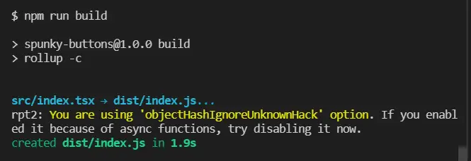
Now run the command npm run build to ensure that everything is done right and the package gets built.
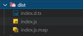
Confirm if the dist directory is created and has the following files:
Using the package without publishing it to npm
If you want to test the package locally (say during development), in another project without publishing it to npm, you can do that as well.
Run the following command after building the project (you may need Administrator privileges)
1npm link
The above command will add our package spunky-buttons to the local npm registry.
Now create a new project where you want to use this package using the following command:
1npx create-react-app spunky-buttons-demo
Inside the newly created project, run the following command:
1npm link spunky-buttons
This points our new project to the spunky-buttons package we have build earlier.
This will not make any entries to package.json. However, you will be able to import spunky-buttons in the new project.
Now add the following styles to App.css to align the buttons neatly:
1.App {2 text-align: center;3 margin-top: 1rem;4 display: flex;5 flex-direction: row;6 justify-content: center;7 gap: 1rem;8 align-items: center;9}
Update the App.js with the following code:
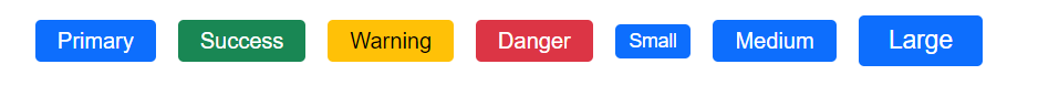
1import SpunkyButton from "spunky-buttons"2import "./App.css"34function App() {5 return (6 <div className="App">7 <SpunkyButton label="Primary" />8 <SpunkyButton label="Success" variant="success" />9 <SpunkyButton label="Warning" variant="warning" />10 <SpunkyButton label="Danger" variant="danger" />11 <SpunkyButton label="Small" size="small" />12 <SpunkyButton label="Medium" />13 <SpunkyButton label="Large" size="large" />14 </div>15 )16}1718export default App
Now if you start the application, you should be able to see the buttons.
Publishing the package to npm
First, create an account with npm, if you haven't already.
After creating the account run the following command inside the project to be published (spunky-buttons).
1npm login
Provide the username, password, and email (the email be public).
Once logged in, run the following command to publish the package.
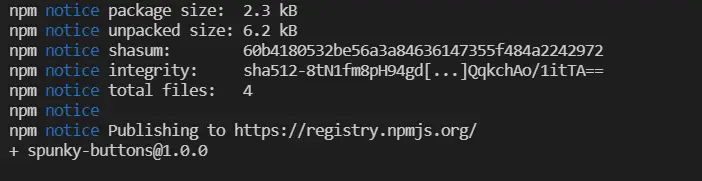
1npm publish
After publishing successfully, you should be able to see the output similar to the following:
If you search for the package in npm, you should be able to see it.
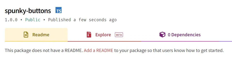
Ensure that you update the description in package.json and create a README file with the details of the package.
Now you can run npm i spunky-buttons to use the published package.
Publishing further versions of the package
If you have made any changes, you need to change the version number in package.json, and run npm publish again.
Version numbers are made of 3 parts.
- Major - When major breaking changes are made, the first number needs to be updated.
- Minor - When a minor change or enhancement is made, the second number needs to be updated.
- Patch - When a bug fix or a patch needs to be done, the last number needs to be incremented.
Example: In [email protected], 16 is the major, 8 is minor, and 1 is the patch version.
To make things easier, we are provided with the following commands
1npm version major # updates from 1.0.0 to 2.0.02npm version minor # updates from 2.0.0 to 2.1.03npm version patch # updates from 2.1.0 to 2.1.1
After the version is updated, run npm publish to publish the latest version to npm.
If you have liked article, do follow me on twitter to get more real time updates!