
Table of Contents
In this tutorial, we will learn how to implement a simple toggle switch in react native. We will also learn how to provide different colors to the switch based on whether it is ON or OFF.
Creating the project
We will be making use of Expo in order to bootstrap our project. If you haven't installed Expo earlier then run the following command to install it:
1npm install --global expo-cli
Now create a new Expo project using the following command. While creating the project, it would ask you to select a template. Choose "blank" template.
1expo init react-native-switch
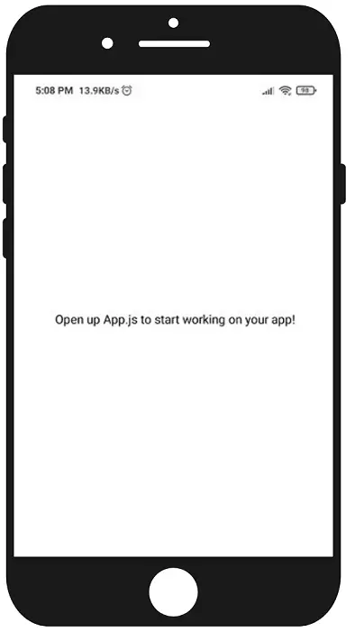
Once the installation is completed run npm start and run the application in your device or
on Android Studio Emulator or
iOS Emulator. You should be able to see the screen as shown below:
The switch component
Update your App.js to the following code:
1import { StatusBar } from "expo-status-bar"2import React from "react"3import { StyleSheet, Text, View, Switch } from "react-native"45export default function App() {6 return (7 <View style={styles.container}>8 <Switch />9 <StatusBar style="auto" />10 </View>11 )12}1314const styles = StyleSheet.create({15 container: {16 flex: 1,17 backgroundColor: "#fff",18 alignItems: "center",19 justifyContent: "center",20 },21})
Here we are importing and including the Switch component.
If you run the app, the switch won't work because we are not doing anything with it.
Making the switch work
For the switch to work, we need to have a local boolean state indicating the current state of the switch and toggle it whenever the switch is pressed.
1import { StatusBar } from "expo-status-bar"2import React, { useState } from "react"3import { StyleSheet, Text, View, Switch } from "react-native"45export default function App() {6 const [enabled, setEnabled] = useState(false)78 const toggleSwitch = () => {9 setEnabled(oldValue => !oldValue)10 }1112 return (13 <View style={styles.container}>14 <Switch onValueChange={toggleSwitch} value={enabled} />15 <StatusBar style="auto" />16 </View>17 )18}1920const styles = StyleSheet.create({21 container: {22 flex: 1,23 backgroundColor: "#fff",24 alignItems: "center",25 justifyContent: "center",26 },27})
Here we are calling toggleSwitch whenever the switch is pressed and
in toggleSwitch function, we are setting the state to the negated value of the previous state.
That is if the previous value is false then change it to true and vice versa.
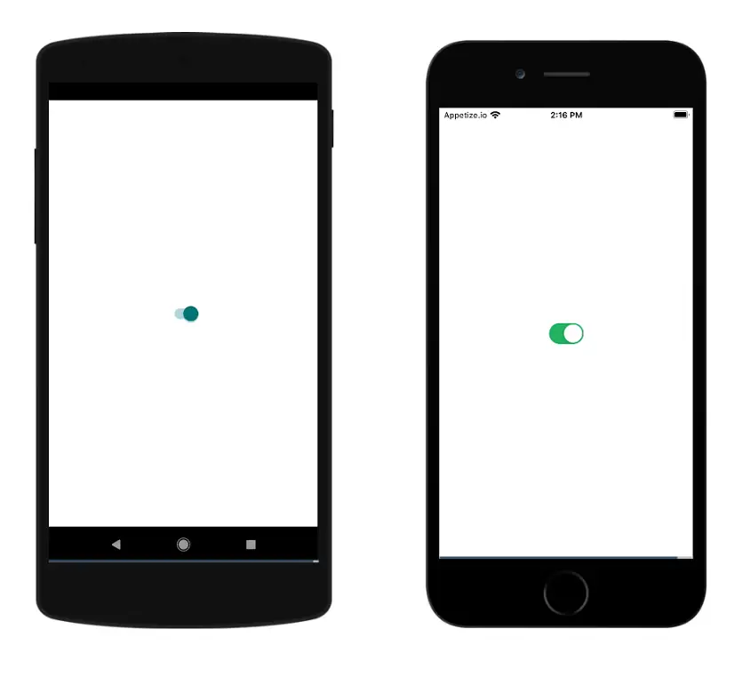
If you run the app in Android/iOS and enable the switch this is how it would look:
Changing the color of the switch
You can change color of the switch from the default one:
1import { StatusBar } from "expo-status-bar"2import React, { useState } from "react"3import { StyleSheet, Text, View, Switch, Platform } from "react-native"45export default function App() {6 const [enabled, setEnabled] = useState(false)78 const toggleSwitch = () => {9 setEnabled(oldValue => !oldValue)10 }1112 const thumbColorOn = Platform.OS === "android" ? "#0cd1e8" : "#f3f3f3"13 const thumbColorOff = Platform.OS === "android" ? "#f04141" : "#f3f3f3"14 const trackColorOn = Platform.OS === "android" ? "#98e7f0" : "#0cd1e8"15 const trackColorOff = Platform.OS === "android" ? "#f3adad" : "#f04141"1617 return (18 <View style={styles.container}>19 <Switch20 onValueChange={toggleSwitch}21 value={enabled}22 thumbColor={enabled ? thumbColorOn : thumbColorOff}23 trackColor={{ false: trackColorOff, true: trackColorOn }}24 ios_backgroundColor={trackColorOff}25 />26 <StatusBar style="auto" />27 </View>28 )29}3031const styles = StyleSheet.create({32 container: {33 flex: 1,34 backgroundColor: "#fff",35 alignItems: "center",36 justifyContent: "center",37 },38})
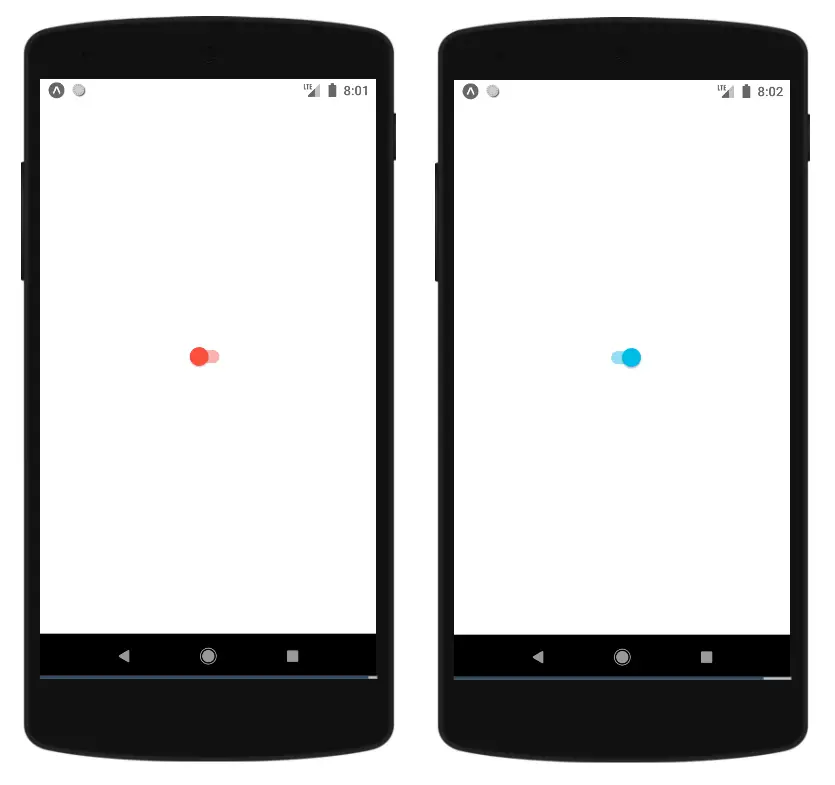
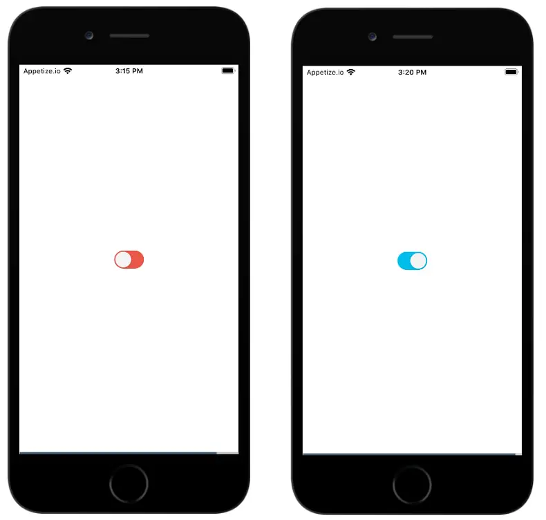
Here we are providing different colors based on whether it is Android or iOS. Also, we could give different colors when the switch is ON and when the switch is OFF.
thumbColor- Used to color the switch grip.trackColor- Used to color the switch track.
In iOS when the switch is off, if you need to color the track then you need to provide it in ios_backgroundColor.
Android:
iOS:
Displaying a text
If you want to show a text based on the switch state you can do that as shown in below code:
1import { StatusBar } from "expo-status-bar"2import React, { useState } from "react"3import { StyleSheet, Text, View, Switch, Platform } from "react-native"45export default function App() {6 const [enabled, setEnabled] = useState(false)78 const toggleSwitch = () => {9 setEnabled(oldValue => !oldValue)10 }1112 const thumbColorOn = Platform.OS === "android" ? "#0cd1e8" : "#f3f3f3"13 const thumbColorOff = Platform.OS === "android" ? "#f04141" : "#f3f3f3"14 const trackColorOn = Platform.OS === "android" ? "#98e7f0" : "#0cd1e8"15 const trackColorOff = Platform.OS === "android" ? "#f3adad" : "#f04141"1617 return (18 <View style={styles.container}>19 <Text>{enabled ? "Switch is ON" : "Switch is OFF"}</Text>20 <Switch21 onValueChange={toggleSwitch}22 value={enabled}23 thumbColor={enabled ? thumbColorOn : thumbColorOff}24 trackColor={{ false: trackColorOff, true: trackColorOn }}25 ios_backgroundColor={trackColorOff}26 />27 <StatusBar style="auto" />28 </View>29 )30}3132const styles = StyleSheet.create({33 container: {34 flex: 1,35 backgroundColor: "#fff",36 alignItems: "center",37 justifyContent: "center",38 },39})
Demo
If you have liked article, do follow me on twitter to get more real time updates!